The pressure to keep up with an always-connected world can weigh heavily on mental well-being, especially for those who grew up in the era of constant notifications. Being bombarded by online offerings takes its toll, which is exactly why the launch of NOMO’s ‘Free the Thumb’ stands as a refreshing and impactful initiative.
Founded by Leo Bursztyn, NOMO (No Missing Out) is a social movement that tackles the pervasive fear of missing out, while promoting positive mental health. When Leo first connected with Marcelo Petrella and the team at Fellow LA, it wasn’t just about another project – it was about something all involved truly believed in. Their longstanding relationship led to a seamless collaboration where both teams were deeply invested not only in production but in shaping the creative direction to bring NOMO’s important message to life in the most impactful way possible.
Talking to LBB’s April Summers, Leo and Marcelo share the behind-the-scenes story of how Fellow LA’s multidisciplinary approach played a pivotal role in crafting a relatable narrative that would captivate and engage NOMO’s audience. As a passion project executed pro bono by Fellow, the collaboration was rooted in a shared belief in NOMO’s mission rather than any commercial agenda.
From aligning on a shared vision to ensuring flawless execution, their discussion sheds light on how transparency, creative innovation, and purpose-driven work can result in something that not only looks great but also makes a real difference.
LBB> Direct-to-brand collaborations typically require a different creative dynamic to traditional agency-led projects. How did working directly with NOMO’s founder shape the process, and what insights have you gained about this evolving model?
Marcelo> Direct-to-brand collaborations are incredibly rewarding but require a different mindset. You have to wear a lot of hats – marketing, strategy, creative development, and content creation all happen simultaneously, often with just a few hands making quick decisions. It’s fast, fluid, and highly collaborative.
Before moving to LA, directing commercials, and running my own production company, I worked in marketing. So I understand the workflow and the big picture. But honestly, the biggest insight I’ve gained is that for this streamlined, hands-on model to work, you have to be truly aligned with the client’s mission and vision. If you don’t genuinely believe in what they’re building, you won’t be able to make fast, instinctive decisions that serve the brand in the right way.
At the end of the day, it’s all about meaningful, passionate, and well-informed collaboration – which, ironically, is exactly what gen z is looking for in their digital and real-world interactions.
LBB> Leo, what behavioural shifts among gen z inspired the creation of this app, and how does NOMO tap into their mindset in a way that traditional social media platforms don’t?
Leo> Gen z knows doomscrolling is bad for them but won’t reduce their social media use alone – FOMO keeps them stuck. Traditional platforms exploit social psychology to hook users; NOMO uses it to help them break free. Our group challenges, streaks, and rewards turn disengagement into a shared experience. Plus, it’s not just about quitting, it’s about replacing doomscrolling with activities that matter.
LBB> Gen z is a notoriously hard-to-reach audience, especially when it comes to messaging about digital habits. How did you approach the challenge of making this campaign feel genuinely engaging and not just another brand telling young people to ‘log off’?
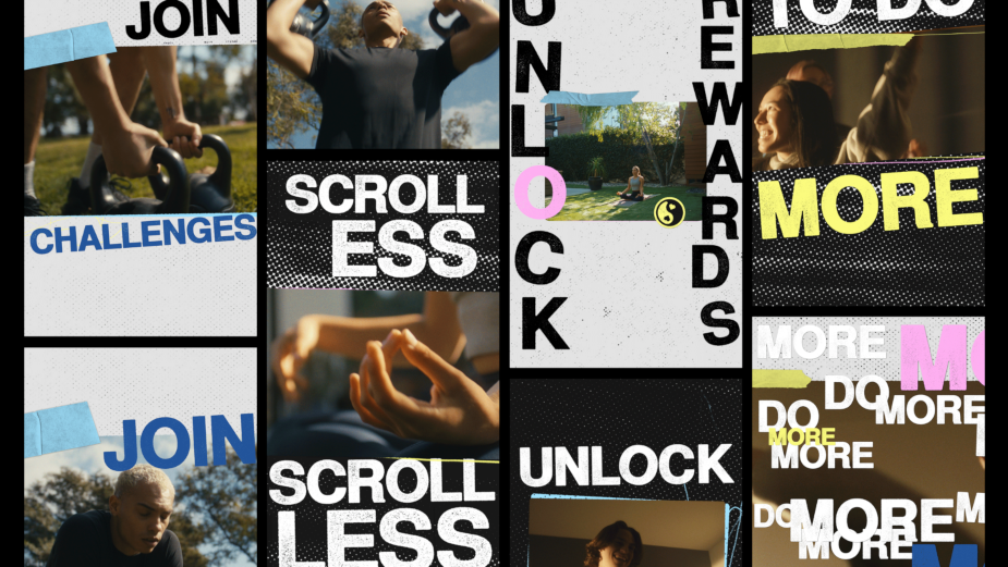
Marcelo> The zine vibe, the handmade textures, the film look, the vinyl, the throwback fits, the playful moments with the camera – none of that is accidental. Every creative choice was rooted in what we know about Gen Z: they’re craving real connection, meaningful experiences, and authenticity. They already know doomscrolling sucks and that FOMO is a real issue. What they don’t want is another brand preaching at them to ‘log off.’
Instead of talking at them, we built a campaign that visually and emotionally reflects their world. The DIY, mixed-media aesthetic taps into their love for nostalgia and analogue culture, while the fast-paced, kinetic energy mirrors the digital world they’re immersed in. The campaign isn’t about rejecting tech; it’s about reclaiming balance, showing them that real life is just as engaging – if not more – than their screens.
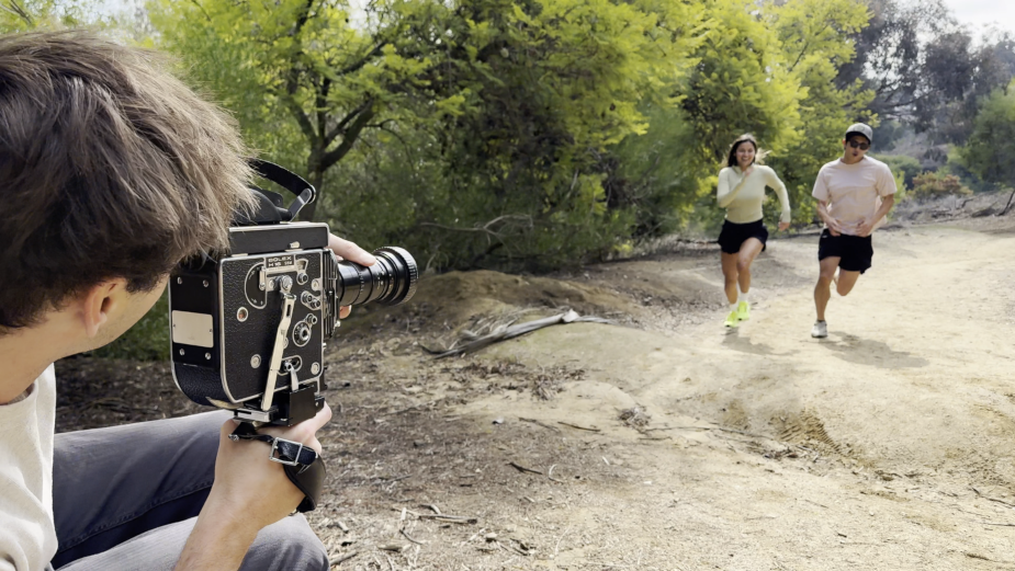
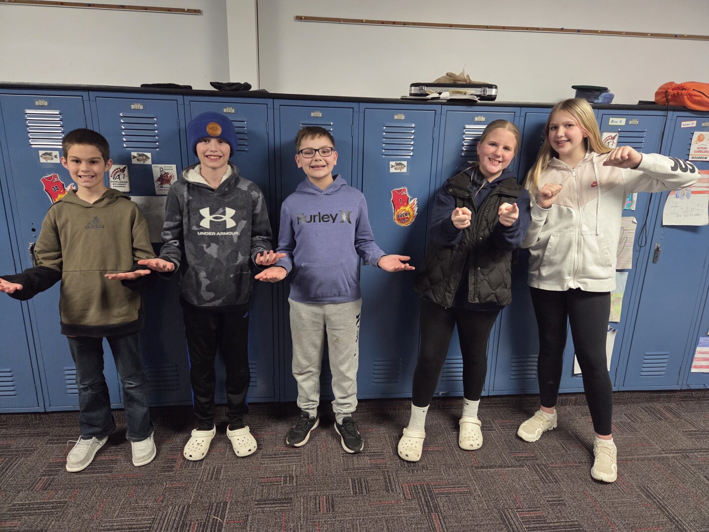
It had to feel like a movement, not a marketing play. The performances needed to be authentic, the interactions unscripted, the energy raw. I gave the gen z cast the space to just be themselves – unfiltered, unforced – so their peers watching would see something real, something they could actually relate to.
It’s not about telling gen z to ‘do less’, it’s about showing them what they gain when they choose to do more. And honestly? Taking back your time and choosing real life over a feed is one hell of a cause to be rebellious about.
LBB> Leo, what was it about Fellow’s approach that aligned with NOMO’s vision, and how did their creative process help bring the brand to life in an unexpected way?
Leo> Fellow understood NOMO as a movement, not just an app. They pushed for bold, scrappy, rebellious design choices that felt real. The punk aesthetic – bold, high-energy, DIY – rejects the polished digital world and invites people to reclaim control. This look isn’t just branding; it’s our movement’s identity – loud, rebellious, and action-driven.
LBB> Marcelo, how did Fellow shape the campaign’s creative direction to ensure it aligned with both the brand’s mission and your own aesthetic sensibilities?
Marcelo> Everything about it. First, the mission – helping gen z scroll less and experience more in the real world. When I learned about Leo’s research, what stood out was that this wasn’t just gen x-ers telling kids to put their phones down. It was about a real craving within gen z itself – the desire to do more, to be more present. And more importantly, the fact that it only takes a few to lead and spark that change. That felt like the right cause to build a movement around.
Then, I saw their initial brand identity, this punk zine aesthetic, pulling from analogue references that took me right back to my own teenage years. I was in.
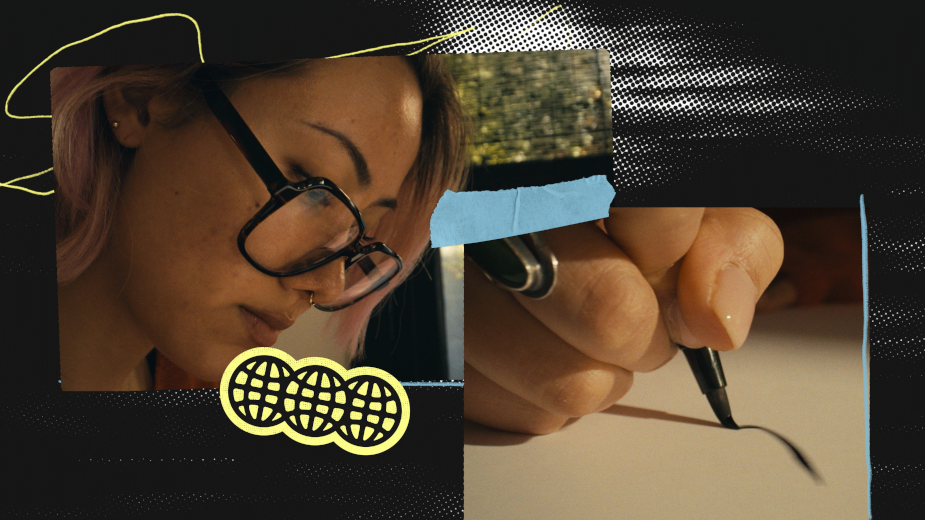
From a creative standpoint, the campaign needed to evoke those vintage analog roots that are already present in gen z’s visual aesthetic, but also feel modern, fast-paced, and dynamic enough to stand out in today’s digital chaos. As a gen x-er, I’ve lived through these analog visuals and sounds firsthand. And as a father of two gen z kids, I see how their tastes are constantly pulling from art, fashion, and music of a less digital past. That mix of nostalgia and forward-thinking energy made this project feel like the perfect creative playground.
Leo> Social media today is over-filtered, performative, and draining. NOMO is the opposite – raw, unfiltered, and real. The punk aesthetic – bold, high-energy, DIY – rejects the polished digital world and invites people to reclaim control. This look isn’t just branding; it’s our movement’s identity – loud, rebellious, and real-world.
LBB> Can you tell us about the creative and technical choices behind this look and how they help communicate NOMO’s message?
Marcelo> A mixed-media approach was a no-brainer for this campaign. We knew we wanted to shoot on film – if not entirely, then at least in part. But walking into a first shoot with a new client and telling them they wouldn’t see any playback didn’t sit right with me.
So, I chose a hybrid approach: half digital, half 16mm. This not only gave us instant playback when needed but also layered the visuals with different textures and energy.
We used the Red Komodo X for our more dynamic, handheld shots, as well as for the macro ‘thumb shots’ with a probe lens. The Sony FX3 was rigged directly onto a dumbbell and a paintbrush to get an embedded, first-person feel. And then we had the Bolex, capturing moments on 16mm, leaning into heavy zooms and a more vintage, documentary-style language.
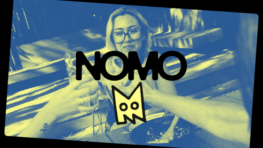
The zine aesthetic naturally welcomes handmade elements and grungy textures, so we embraced the mixed formats and the natural negative space they created in the frame. That became our canvas for the layered design – halftone textures, contact sheet references, tape, grease pencil scribbles, distressed fonts, and thick-stroked NOMO stickers – all choreographed into what I like to call organized chaos.
But none of this would have worked without the right energy from the cast. We didn’t want anything to feel staged or overproduced – we wanted real joy, real movement, real presence. That meant casting people who felt genuinely at home in these moments, letting them enjoy themselves, be silly, and let the joy breathe on camera. That authenticity was key to making the spot feel relatable, aspirational, but never forced.
LBB> What are you most proud of about this project?
Marcelo> I am proud of the team we assembled and the collaborative process. This was a fast-moving project from concept to execution, and it required a team that could think on their feet, pivot quickly, and truly own their roles.
Our DP, Jimmy Derner, stuck with us through two last-minute schedule pushes due to weather and still showed up on the day with enthusiasm and spontaneous shot ideas that elevated the visuals. Brett Nicoletti, our editor, wasn’t just cutting the piece – he was also capturing sound on set, layering in real ambient textures to make every scene feel alive. And Jeffrey Hazelwood took a few style frames, some references, and ran with them – bringing the NOMO zine aesthetic to life through animation.
From concept through production and post, you could feel the energy – everyone believed in what we were making. That made decision-making seamless, communication fluid, and the creative fearless.
There’s always a moment in a project where you wonder if all the moving parts will come together. And then you see it – those first cuts in the edit, the way everything flows, the energy behind it. The final piece reflects the love, spontaneity, and commitment that went into this project.
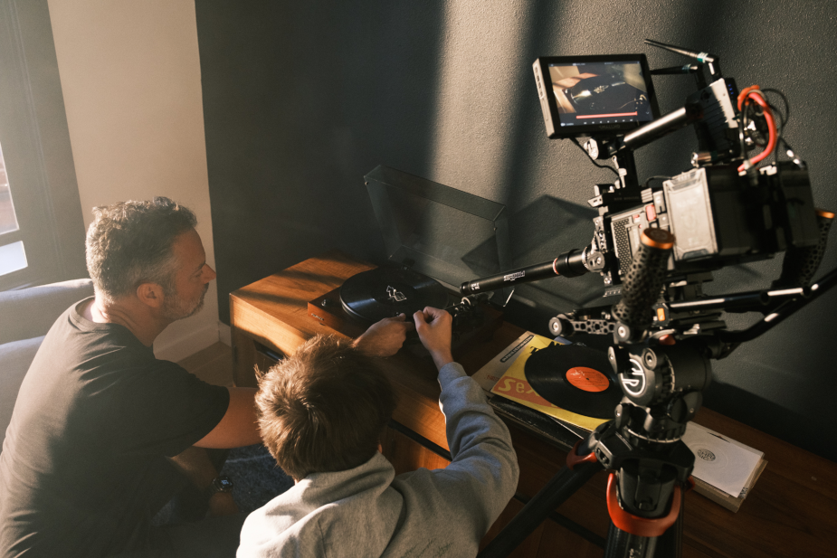
Leo> I’m proud of so many things. I loved how collaborative the whole process was. It felt like I was brainstorming with an extremely talented set of friends. Nothing was impossible. Every idea was met with excitement, professionalism, attention to detail and the pursuit of excellence. It also makes me really happy that the whole team really embraced our mission: it made a whole world of difference!
link